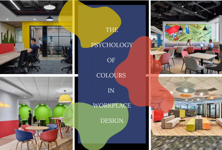
Colours in an office environment can significantly impact the mental well-being and productivity of the staff, which ultimately translates into a positive image for the business. Getting the right colour combination is a subtle yet crucial factor for a business’s success, as getting it wrong may affect the image, culture, and employee engagement.
In workplaces, colour is being used by interior designers as a tool to promote emotional responses among colleagues to ultimately encourage and bonding and collaboration. As a rule of thumb, colours that are reminiscent of nature are always a go-to palette —especially where we want the spirit of workplace wellness to dominate.

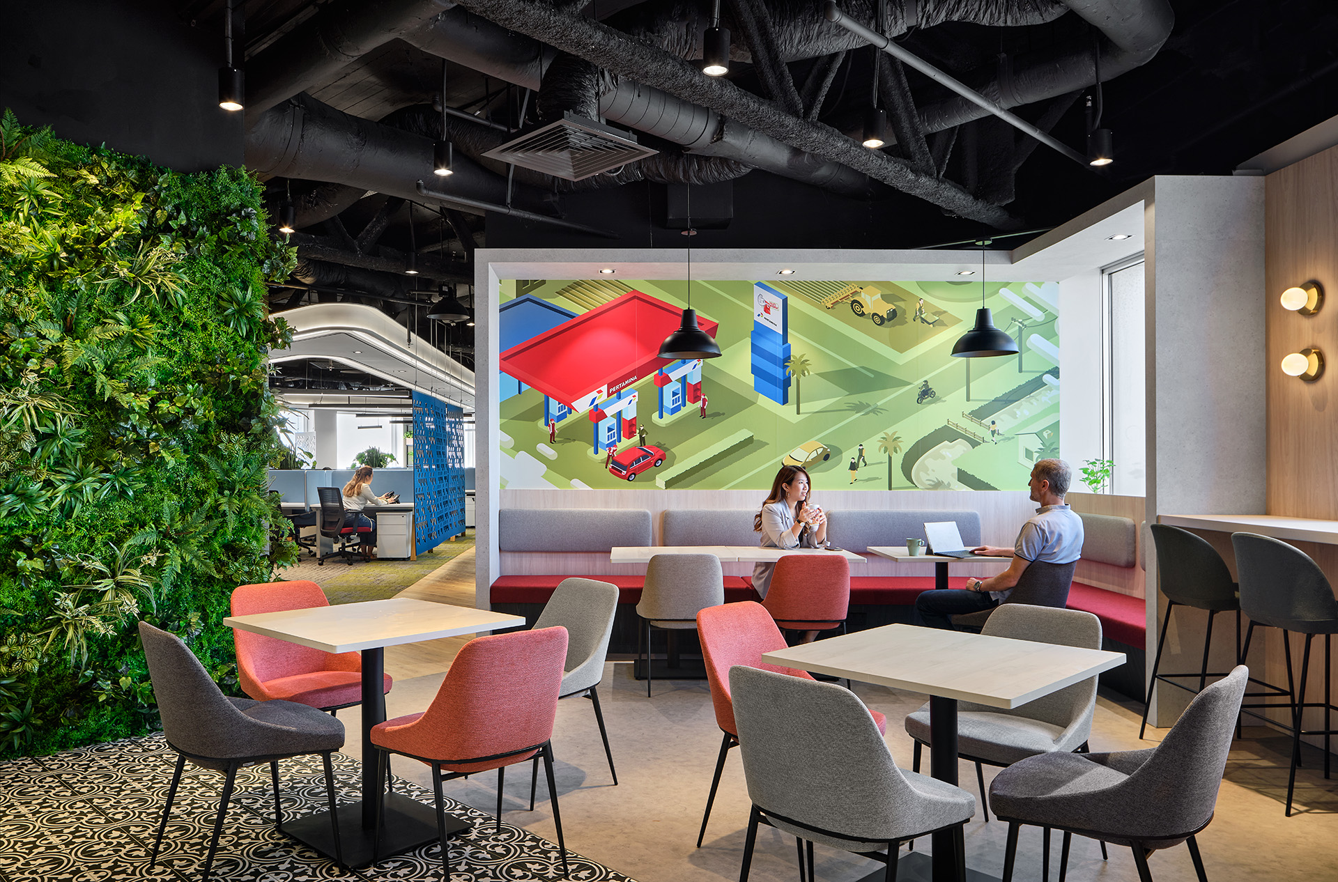
For Pertamina’s new office, biophilic elements are applied in the breakout collaboration area. The inclusion of greeneries takes the positive effects of nature to the next level. This inadvertently helps employees and visitors to the space feel more relaxed. Pop colors are also scattered throughout the interior to achieve a visual balance between corporate professionalism and fun dynamism. Given their corporate colors are already dynamic, it’s easier for us to design the color palette into the various spaces, exciting the visual senses psychologically.
As we spend up to eight hours in the workplace, it’s no surprise that color and space can affect our productivity and wellbeing. Ensuring that you choose the right color for your work environment can help reduce stress and depression while creating a sense of calm, happiness, and creativity. Incorporating a color palette into your flexible and agile workspace will help revolutionize your business.
“Colours, like features follow the changes of the emotions.”
– Pablo Picasso

Colour has a significant impact on our mood and behavior, influencing how we respond to different spaces. In the context of Keppel Shipyard, a leading industrial organization, we recognized the need for a fresh space to appeal to a younger workforce and revitalize their current team.
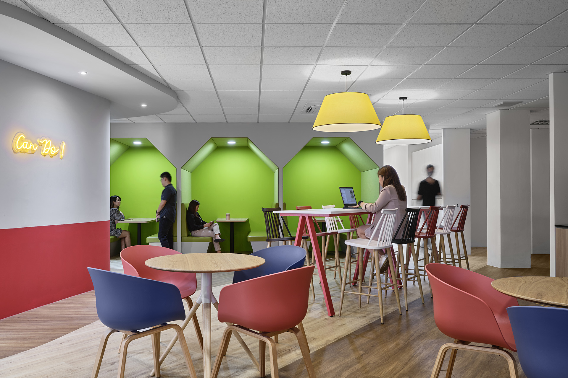
Despite the company’s focus on functionality and maintenance, we identified an opportunity to introduce a new color scheme that would not only reflect their brand image but also enhance the visual appeal of their workspaces. The main corporate colors, which immediately evoke their brand image, are the first tier of color adoption. We further introduced vibrant hues in collaborative and breakout spaces to create a visually appealing environment that fosters creativity and productivity.
On a side note, it’s worth noting the therapeutic benefits of different colors:
- Red: Raises blood temperature and stimulates circulation, often used to care for people with anemia, fatigue, paralysis, and exhaustion.
- Blue: Soothes and calms, used for cases of inflammatory conditions, burns, and bruises. It also helps alleviate tension, stress, and problems with the immune system, as well as relieve insomnia, anxiety, high blood pressure, migraines, and skin irritation.
- Yellow: Used to aid in digestion and liver function, with decongestant and antibacterial properties that act as a cleanser for the body. It has been known to help relieve rheumatism and arthritis.
- Green: Creates balance and harmony within the body, particularly beneficial for heart and blood problems. It is known to influence the human cell structure and muscles.
- Orange: Gives vitality to the body and is associated with the kidneys, urinary tract, and reproductive organs.
- Purple: Associated with the eyes, ears, nose, and mouth. It helps with head congestion and sinuses and is known to calm the nervous system.
By incorporating these colors into their workspace design, Keppel Shipyard aimed to create a more engaging and stimulating environment that would benefit both their employees’ well-being and productivity.

Colour plays a significant role in how people respond to time spent in a particular space. For instance, the colour scheme of walls and fabrics in a space can greatly impact a person’s response to that space. This response to colour often directly correlates with a person’s comfort and well-being, and this phenomenon is known as chromotherapy.
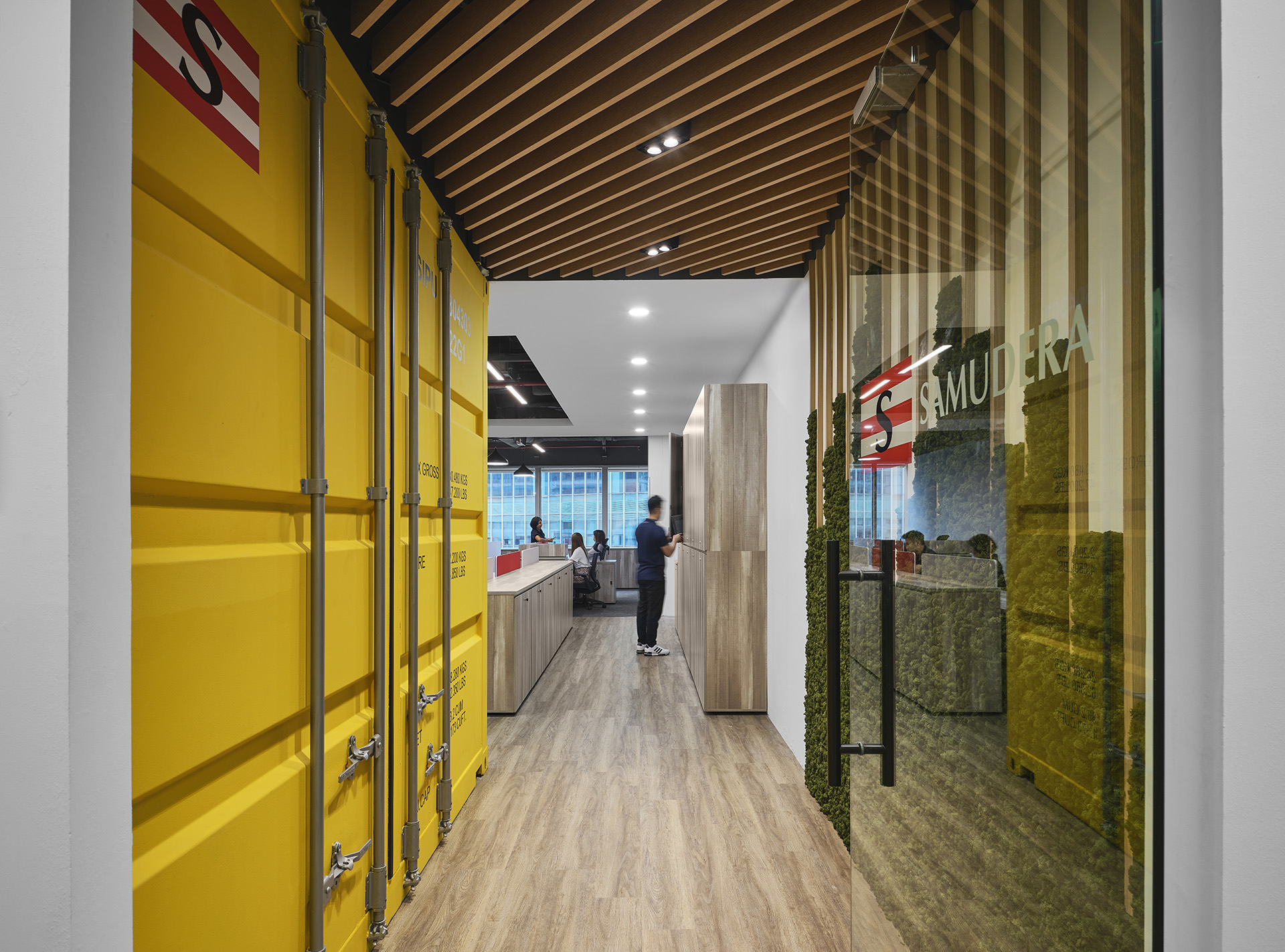
For Samudera Shipping, we adopted their in-house colour palette as the visual feature. A bold yellow container meeting room serves as the dominant focal point in the workspace. The remaining materials were kept neutral and natural to create a calming atmosphere. Our goal was to make the office feel cosy and inviting. We also ensured the flow of natural light to bring out the full vibrancy of the interior colours.
In Summary
One thing most workplaces will have, whether it’s an office, factory or a retail setting, is clear branding for employees and customers. Often, the colours used in your branding are the same colours used when designing the workplace. Before you can use colours to influence emotions and behaviour in your workplace, you should have a basic understanding of what emotions each colour triggers. What does your brand or workplace say about you? Employees spend a large part of their lives at work, so you want to make sure you have a workspace designed in a way which has the capability to bring out the best of the individuals. Colour psychology explores the emotions that different colours trigger in us. The emotions we feel influence our decisions, our moods and our actions. Therefore, choose your colours… wisely!


